- Animal Kingdom: Cross Breeding > Dogs, mule, zorse, tigon, liger.
- People and Objects: Fashion > Props and clothing > possessions, social expectations, blurring of human form and objects > balance of importance.
- Contrasting Combinations: Light and dark, black and white, men and women, youth and age, fruit and sweets, sugar and salt, Microsoft and Apple > rivalry > war.
- Food and Drink: Fish and chips > life and death, egg and bacon > farm life > different habitats > culture > religion > global and local.
- Colour: Complimentary colours, Primary colours > secondary colours > tertiary colours, psychological effects of specific colours> the alliance of the human mind and basic colour.
- Reflections: Windows, puddles > ripples > altered vision > surrealism.
Wednesday, 31 December 2014
Combinations and Alliances Mindmap
Tuesday, 30 December 2014
Praktica + Snow Shoot

In this shoot I wanted to dive straight into my exam title "Combinations and Alliances". I have attempted create a connection between both the camera in the image and the snow whilst also having a less obvious connection to that of the viewer. The initial shock of this combination of snow and the camera I feel automatically creates a sense of worry. Looking more in depth to the construction of snow and the purpose of a camera is rather interesting. Snow is essentially frozen water whilst a camera in turn captures or 'freezes' a moment in time which can be as naturally beautiful as snow or as artificial depending on the image taken and how it is manipulated.
Monday, 29 December 2014
Praktica 1st Graphic Art Edit
 Here is a print screen at the end of my editing for my more graphics style edit to show the amount of layers I have used to come to this final outcome. I have had to duplicate my original images of these cameras multiple times and applied different density threshold filters so that I could gain detail in all of the camera, rather than just the lenses or body's for example.
 Here is the final image for my experimentation in creating a more graphics art based image for this shoot. I am happy with this image aesthetically, however I feel it is a rather flat, dimensionless image as far as my initial intentions are concerned for this shoot and its connection to the viewer and the cameras connection to the snow.
Sunday, 28 December 2014
Praktica 2nd Edit
 This is my favourite image from this shoot for multiple reasons. The inclusion of the dead plant stems allows the viewer to subconsciously assume the 'owner' of this camera has dropped it in the snow, which supports my original intentions for this shoot to create a connection triangle between the camera, snow and viewer. The fact that the stems also come in contact with and overlay the camera suggest that it is becoming a part of the snow and being consumed as the plants have also.
 When looking for aspects of this image to improve is post production, I noticed that the snow itself is not exactly white, which is fortunate as I shot in RAW format so this was an easy error to correct. I also felt that using curves to create a strong contrast within the image would give the image a more sharp impact which supports my intentions for this image. I found black and white meant that the Praktica camera appeared more vintage and the snow whiter and overall was an aesthetic improvement as the image initially didn't have a lot of prominent colours rather than tones.
Saturday, 27 December 2014
Tea + Snow Shoot

Taking further advantage of the rare opportunity of snow, I tried to think of another interesting combination to experiment with. Eventually I began to look into how previously in my Praktica the snow and camera were beginning to combine as one. From here I soon thought about the contrast of hot and cold and how they effect each other. As you can see I have placed a boiling hot cup of tea out in the snow and have documented throughout my shoot how the heat of the tea has caused the snow to melt. The reaction of the snow melting was not as visible as I had hoped for however the evidence remains with the movement of the teacup which I think is rather interesting as like my Praktica shoot the snow is consuming yet another object.
Friday, 26 December 2014
Tea + Snow Edit/Final Image
 This image I feel really captures the exact moment in which the cup has began to combine with the snow. As with my Praktica shoot I have struggled to achieve a perfect white colour within the snow and it is still slightly blue. I feel the top of this image is slightly distracting and that I could crop this image for a more powerful composition.
 As I said I could, I have cropped the image so that it is far less distracting and also so that I have used the rule of thirds far better in order to create a stronger composition. I have sharpened the image to emphasise the crispness of the snow which is later destroyed by the tea and its heat. I also find it interesting that the cup actually has the word 'friendly' on it which is humorous as it is being anything from friendly to that of the snow. Initially I made the whole image black and white however I felt this made the liquid in the cup seem cold and ruined the contrast of temperature in the image, so I have used a clipping mask on the black and white filter layer to restore the colour of the tea within the image.
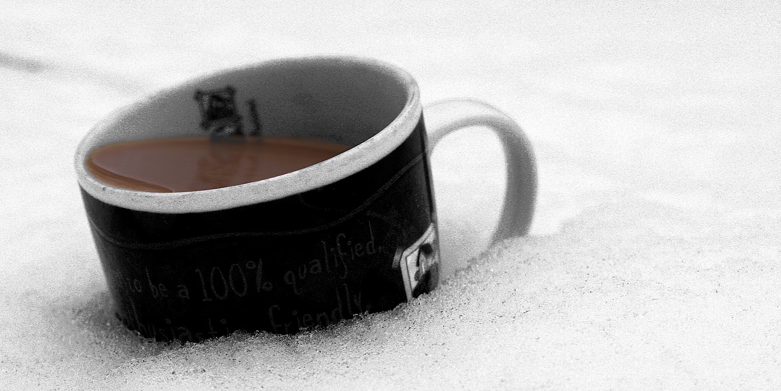
Thursday, 25 December 2014
Christo and Jeanne-Claude
I find the work of Christo and Jeanne-Claude inspiring me within this project as they create artificial combinations of objects by wrapping them in material with such intricate detail, creating something new and creative. I think this might help me to explore a particular rough idea I have of wanting to combine human models with objects to create almost a new an unheard of alliance. Whilst these artists are not actually concerned about photographs but rather about viewing the physical art, their work provides photographers to achieve a similar piece of work to theirs in that they can capture something never yet seen.
 Only vertical, possible stretch lines where they could have stretched the material, almost changes the directions to which you usually associate with a bridge. The use of one colour could possibly be to symbolise the fact that it is essentially only one object that has been wrapped despite its complex structure. Whilst being a physical creation, when viewing the an image of it the idea of surrealism very much springs to my mind,whilst also making the object rather abstract.
 This image in particular interested me as I like the extension of the trees forms whilst they remain transparent. Possibly the artists are commenting environmental factors and the importance of nature and how its visibility is slowly declining, which is backed up by the fact the surrounding area other than these few trees is empty. As a photographer I especially am inspired by the use of light in this images to highlight this multi dimension piece of art in which Christo and Jeanne-Claude have created.
Subscribe to:
Posts (Atom)