- Animal Kingdom: Cross Breeding > Dogs, mule, zorse, tigon, liger.
- People and Objects: Fashion > Props and clothing > possessions, social expectations, blurring of human form and objects > balance of importance.
- Contrasting Combinations: Light and dark, black and white, men and women, youth and age, fruit and sweets, sugar and salt, Microsoft and Apple > rivalry > war.
- Food and Drink: Fish and chips > life and death, egg and bacon > farm life > different habitats > culture > religion > global and local.
- Colour: Complimentary colours, Primary colours > secondary colours > tertiary colours, psychological effects of specific colours> the alliance of the human mind and basic colour.
- Reflections: Windows, puddles > ripples > altered vision > surrealism.
Wednesday, 31 December 2014
Combinations and Alliances Mindmap
Tuesday, 30 December 2014
Praktica + Snow Shoot

In this shoot I wanted to dive straight into my exam title "Combinations and Alliances". I have attempted create a connection between both the camera in the image and the snow whilst also having a less obvious connection to that of the viewer. The initial shock of this combination of snow and the camera I feel automatically creates a sense of worry. Looking more in depth to the construction of snow and the purpose of a camera is rather interesting. Snow is essentially frozen water whilst a camera in turn captures or 'freezes' a moment in time which can be as naturally beautiful as snow or as artificial depending on the image taken and how it is manipulated.
Monday, 29 December 2014
Praktica 1st Graphic Art Edit
 Here is a print screen at the end of my editing for my more graphics style edit to show the amount of layers I have used to come to this final outcome. I have had to duplicate my original images of these cameras multiple times and applied different density threshold filters so that I could gain detail in all of the camera, rather than just the lenses or body's for example.
 Here is the final image for my experimentation in creating a more graphics art based image for this shoot. I am happy with this image aesthetically, however I feel it is a rather flat, dimensionless image as far as my initial intentions are concerned for this shoot and its connection to the viewer and the cameras connection to the snow.
Sunday, 28 December 2014
Praktica 2nd Edit
 This is my favourite image from this shoot for multiple reasons. The inclusion of the dead plant stems allows the viewer to subconsciously assume the 'owner' of this camera has dropped it in the snow, which supports my original intentions for this shoot to create a connection triangle between the camera, snow and viewer. The fact that the stems also come in contact with and overlay the camera suggest that it is becoming a part of the snow and being consumed as the plants have also.
 When looking for aspects of this image to improve is post production, I noticed that the snow itself is not exactly white, which is fortunate as I shot in RAW format so this was an easy error to correct. I also felt that using curves to create a strong contrast within the image would give the image a more sharp impact which supports my intentions for this image. I found black and white meant that the Praktica camera appeared more vintage and the snow whiter and overall was an aesthetic improvement as the image initially didn't have a lot of prominent colours rather than tones.
Saturday, 27 December 2014
Tea + Snow Shoot

Taking further advantage of the rare opportunity of snow, I tried to think of another interesting combination to experiment with. Eventually I began to look into how previously in my Praktica the snow and camera were beginning to combine as one. From here I soon thought about the contrast of hot and cold and how they effect each other. As you can see I have placed a boiling hot cup of tea out in the snow and have documented throughout my shoot how the heat of the tea has caused the snow to melt. The reaction of the snow melting was not as visible as I had hoped for however the evidence remains with the movement of the teacup which I think is rather interesting as like my Praktica shoot the snow is consuming yet another object.
Friday, 26 December 2014
Tea + Snow Edit/Final Image
 This image I feel really captures the exact moment in which the cup has began to combine with the snow. As with my Praktica shoot I have struggled to achieve a perfect white colour within the snow and it is still slightly blue. I feel the top of this image is slightly distracting and that I could crop this image for a more powerful composition.
 As I said I could, I have cropped the image so that it is far less distracting and also so that I have used the rule of thirds far better in order to create a stronger composition. I have sharpened the image to emphasise the crispness of the snow which is later destroyed by the tea and its heat. I also find it interesting that the cup actually has the word 'friendly' on it which is humorous as it is being anything from friendly to that of the snow. Initially I made the whole image black and white however I felt this made the liquid in the cup seem cold and ruined the contrast of temperature in the image, so I have used a clipping mask on the black and white filter layer to restore the colour of the tea within the image.
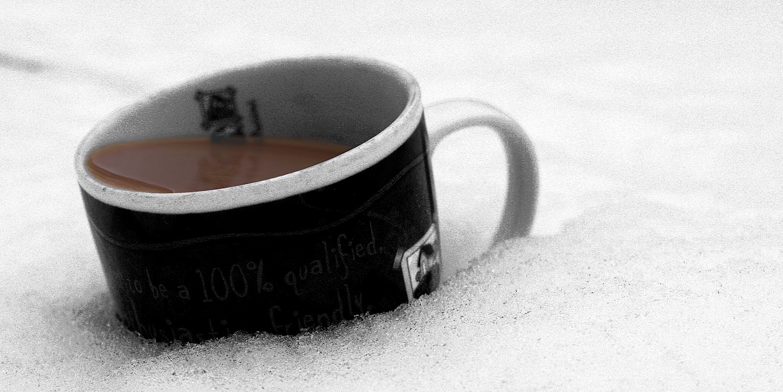
Thursday, 25 December 2014
Christo and Jeanne-Claude
I find the work of Christo and Jeanne-Claude inspiring me within this project as they create artificial combinations of objects by wrapping them in material with such intricate detail, creating something new and creative. I think this might help me to explore a particular rough idea I have of wanting to combine human models with objects to create almost a new an unheard of alliance. Whilst these artists are not actually concerned about photographs but rather about viewing the physical art, their work provides photographers to achieve a similar piece of work to theirs in that they can capture something never yet seen.
 Only vertical, possible stretch lines where they could have stretched the material, almost changes the directions to which you usually associate with a bridge. The use of one colour could possibly be to symbolise the fact that it is essentially only one object that has been wrapped despite its complex structure. Whilst being a physical creation, when viewing the an image of it the idea of surrealism very much springs to my mind,whilst also making the object rather abstract.
 This image in particular interested me as I like the extension of the trees forms whilst they remain transparent. Possibly the artists are commenting environmental factors and the importance of nature and how its visibility is slowly declining, which is backed up by the fact the surrounding area other than these few trees is empty. As a photographer I especially am inspired by the use of light in this images to highlight this multi dimension piece of art in which Christo and Jeanne-Claude have created.
Wednesday, 24 December 2014
Cinemagraphs by Jamie Beck and Kevin Burg

Cinemagraphy is something I found during research and is essentially a still image with simply one element that moves like a video. I am interested in trying out this technique as it seems challenging and also seems to have really strong outcomes. When researching them I found quite a few that looked rather childish and were anything but subtle. After a while I came across two artists named Jamie Beck and Kevin Burg who I feel usually create fascinating cinemagraphs, whilst keeping them subtle. I particularly like the attention to detail within this image as far as the mirrors are concerned. Without her reflections also moving the viewer would soon realise and then the whole image would seem poorly executed.

One thing I like particularly about Jamie Beck and Kevin Burgs cinemagraphs is that they do not use the idea of a moving element in order to solely make an aesthetically pleasing image. Their images even viewed as still would be strong in many aspects.
Tuesday, 23 December 2014
Lighter + cling film cinemagraph

Within this shoot I wanted to create a fusion between a human and an object making them one whilst using similar a wrapping technique similar to that of Christo and Jeanne-Claude. The reason for the use of the cinemagraph medium is that I wanted to add a particular focus on the flame. I aimed to achieve this as I feel it is one of two objects which are essentially 'smoking' and it is object in which the user has the most control of. Wrapping the lighter in with my models hand helps to portray the addiction of smoking and how ultimately it can become a part of someone and become one single combination. One thing I would improve if i next make a cinemagraph is to take an individual still image to use as the frozen sections as creating a still from video leaves me working with a rather low resolution image which can not be enlarged as much as I would like to usually. Overall I feel this cinemagraphy has overall been pretty well executed and without the motion element I feel this image itself is rather well composed.
Monday, 22 December 2014
Further Cinemagraphy experimentation
 Within this image I wanted to mainly explore further the use of cinemagraphy but also I wanted to explore the idea of more than one dimension within my image without using dual layers. I like the fact that you can see both the front and back of her head however only her eyes move as it almost detaches the two which from her viewpoint is very much the case, I also like how you only see the moving reflection of her eyes and not her actual eyes. There is something I really like about the composition of the image as almost more than three quarters of it are almost ignored as soon as the viewer notices her eyes moving and I feel this shows the importance of her face in comparison to the back of her head.
Sunday, 21 December 2014
Don Eddy - Harley Hub

This image by Don Eddy was very interesting to me after finishing my last cinemagraph as he too has used a mirroring surface rather interestingly. It is not often you see the photographer that took the shot within the actual image however here this is not the case. The actual object itself seems not to be of main importance as to me personally I would not be able to tell what it was without the addition of the title. Having said this the reflection from the hub itself is an interesting image as it is distorted rather like a fish eye lens effect. This distortion makes the image seems rather surreal and almost as if the photographer who at first thought is definitely there, may well just be an effect of a surrealist image.
Saturday, 20 December 2014
Reflection in the water shoot plan

In this plan I am trying to organise a shoot in which I can distort my model reflection in water. With further thought on how I could incorporate cinemagraphy into this image I thought of moving his reflection only, rather than simply causing ripples to the water. I wanted to create something quite surreal in this shoot and I quite like the idea of his reflection being its own person and being in control of itself. Having said this I have planned to make his reflection to simply walk off away from him to the right and then eventually return back to where it began so I could loop it. Another idea is to experiment into half making a cinemagraph which actually simply becomes a still image to explore the boundaries between the still image and cinemagraph mediums.
Friday, 19 December 2014
Reflection in the water testing angles shoot

In this shoot I was simply taking still images of possible angles in which I would shoot the video for my next cinemagraph. I was trying to achieve a visible reflection of my model in the water alongside it being rather distorted due to the waters movement. I like the angles of the last two shots however I would not be able to shoot a still video like this as I was literally holding my camera over the water. 5549 is far to dark, distracted by birds and has a rather unaesthetic background, not to mention there is next to none of a reflection in the water. I feel the most achievable and strong reflection in the water and composition within the image is that of 5547. This is the angle in which I chose to shoot my main video.
Thursday, 18 December 2014
Still Image Experimentation

Seeing as I could not achieve this angle with film I have decided to edit and produce a final image from it instead. The thing I like mostly about this image is that the angle of the image gives it energy however it is rather ironic that actually this image doesn't move at all. I am very happy with my choice of asking my model to wear only white and blue clothing as it means I have forced the distortion of him and the water further as well creating a connection with him and the sky.

I felt the above version of this image was slightly distracted his surroundings so I decided to experiment cropping it to be a bit more compact and I feel this has oddly weakened the composition as before the water took up almost 50% of the image and now is a lot less of that percentage. Turning the image into a rather high contrast black and white image I thought I could create a slightly less happy 'summertime' feeling within the image and make it seem a bit more serious to match my models facial expression.
Wednesday, 17 December 2014
Reflection in the water progression

Here I have decided to boost the contrast by +150. Whilst this contrast boost has given me the saturation of colour that I wanted it has also boosted the green colour of the grass. I feel this takes the focus slightly away from the water and my model.

This image contains a lot more frames than my previous cinemagraphs and this meant it took a lot more time to place layer masks on each frame. I am very happy with this image as it is almost exactly how I wanted it to turn out. One thing that does bug me particularly is that the image itself looks washed out and has no particular strong saturation of colours. This means that the whole idea of him wearing similar colours and the water and sky is almost wasted.
Tuesday, 16 December 2014
Reflection in the water final cinemagraph

Here is my final edit of this cinemagraph and I have finally got it to be exactly what I was aiming for from this shoot. Having boosted the contrast in this image boosted the saturation of the water to such rich blues and this automatically attracts the viewers eyes. In cooperation with this the lowering of the grasses saturation also had an effect. I tried for a long time to find the best frames to tween at points where I have cut the video and whilst they are not perfect, I feel that they are acceptable.
Monday, 15 December 2014
Dolls House Plan

Sunday, 14 December 2014
Dolls house angle test shoot

This shoot I took with a point and shoot camera just to plan out what rooms I wanted to use in the dolls house I have decided to use. I have decided which image I feel has the best amount of darkness, angle and composition and that is 2531. I have drawn in some possible outlines where I think larger picture frames could be added however I plan to add around 4-5 frames in total. After taking 2553 I have not been able to come to a conclusion whether or not this "revealing" image would be better to use as it would let the viewer immediately realise the setting. This in turn might ruin the eerie tone I wanted to create and also might make the viewers not realise the movement in the picture frames as the image itself is far less focused in on the specific area.
Saturday, 13 December 2014
Photo Frame Sketches and Ideas
 Here are two initial plans for images that could go in the photo frames of my dolls house image. Following inspiration gained from Gillian Wearing I am also going to try and include an old family image into one of the frames and try to then create a moving element or perhaps an element which ties it to a more updated time.
Friday, 12 December 2014
Gilliam Wearing 'Album' Series

 Here is what Gillian Wearing titled 'Album'. It consists of 6 images in which she has recreated old family images by placing wax masks of her family and posing to be them, distorting the reality into surreal and eerie images.

Here in these images we find Gillian posing as her grandfather and grandmother (top left and top right), her mother and father (middle left and middle right) and her sister (middle right) as well as her younger self at the age of three(bottom left). I particularly like how Gillian has created a very different tone to these images through her recreation. There is a definate eeriness within these images and upon further inspection it is possible to say this is because of how the eyes of her 'family' are all exactly the same and are also the only real areas that give a clue it is in fact a mask. This eeriness is similar to that of which I want included in my dolls house image and further leads to how I will have replaced the location of an actual lifesize bedroom with that of a model dolls house bedroom.
Thursday, 11 December 2014
Dolls House: Fireplace


With inspiration from Gillian Wearing recreating her families picture album years after and how she creates such eerie effects with this I looked through my family pictures to try and find a picture I could recreate. I found the picture of our fireplace to the right which was taken more or less when we first moved in and have tried to capture the exact same angle in my up to date image to the left. Below I have created a fading tween between both of these images in hope of placing it in a picture frame of my dolls house image. I have also made the image sepia so that contextually it seems to suit the aesthetics of the dolls house room.

Wednesday, 10 December 2014
Angus McBean

Here is a photograph of Audrey Hepburn and the final outcome of McBean's masking layers to create a surreal image is one of sublety. There is careful consideration of the angle of light within the possible three to four layers (Hepburn, clouds, pillars, ground) in which they are all highly similar. I particularly am interested in how the background of the image has in fact become a part of the foreground and has arguably replaced her clothing. making her seem connected somewhat to her surroundings.

Here is a self portrait of Angus McBean, Multi-angles of the same subject within this single image are being used as different platforms for his ideas.The thought process itself must have taken a long while and i particularly am inspired by the masking of the back of his head being used to create a 'canvas', for the paint brush as he is an artist.
 This self portrait is similar to to above however seems to say less about his actual personality whilst remaining just as complicated as far as composition is concerned. This shows how it is very easy whilst playing with multiple masked layers to create something very different and perhaps less effective.
McBeans Technique
McBean uses multiple layers using film and panels of glass masked with a particular colour of paint so as not to expose the areas of the paper where, for example, he wants to place the next image on the paper. This technique would be easily recreated in photoshop and I will most likely use this digital form of photography and printing however I definately want to experiment with using 35mm film in the darkroom as I feel that it will appear far more authentic with such surreal imagery.
Tuesday, 9 December 2014
McBean style portrait shoot

In this shoot I wanted to try my own version of McBeans self-portrait. I have tried to capture many different angles of my model in as many different lighting situations despite the fact the light I had to use was too bright and did not provide me with the shadows I wanted to capture on his face however as I shot them in raw this was easily fixable. Next I plan to almost rearrange a few of these images into one single portrait in which each image covers the previous shadows which were present.
Monday, 8 December 2014
Facial Expression(s)

Here is a final image I have created in which three angles of my models face have been layered in order to reveal the details of his face which were previously distorted/covered by lack of lighting. I feel the overall effect of this image is exactly what I had in mind as it does imitate the style of McBean and how his portraits contain seemingly unnecessary editing which achieve the same appearance as far as basic detail is concerned however in a much more complicated and technical manner.Despite not being part of my initial intentions, there are lines in the background of this image and I feel that they actually give direction in the image, especially the parallel diagonal lines which direct the viewers eyes to the model, further enforcing the importance of focus on him. I am curious whether or not this portrait could be cropped in order to experiment different ways to emphasise the importance of focus on the model and his serious facial expression which do not reveal any hint of this being a misleading act of facial expression.

Here I have tried to crop the image ever so slightly so that there is a stronger stress on the importance on the models facial expression(s). Whilst being far more focused on the model than the surrounding background, I feel the lack of the some of the previous directional lines somewhat weakens the image and the attention to his facial expression(s).
Sunday, 7 December 2014
Bike Merged portrait

With this shoot I wanted to capture many angles and interesting parts of my bike as I wanted to experiment with McBean's style on an object rather than a person. I have taken some images and I know where I will be merging them, for example the bike chain I wish to replace some of the body frame with. I particularly like 5789 as it will help to add a moving element to the end product as the bikes primary purpose is for transport. I have a feeling the editing for this will be far more challenging and time consuming than my previous portrait image.
Saturday, 6 December 2014
Bike Parts Final Image

Here is my final bike collage and I feel that I have achieved exactly the effect that I wanted to with this image. I wanted to distort the proportions of the bike parts and their places as I wanted to explore the importance of all of them and how their individual importance is unimportant as they work together to create one single outcome. As is visible I have made changes such as the pedal replacing the seat, the front wheel moving is now the back wheel and for a front wheel you have the gear system of the bike and arguably most noticeable is the change of the bike chain for the body frame of the bike. The choice of the background relies mainly on aesthetic choice however clearly has a link to the bike as it consists partially of the sprocket from the gear system. Overall I feel this has been a successful experiment and I am happy with how the image explores the importance of each of the bikes parts in relation to its main purpose of transport.
Friday, 5 December 2014
Human & Object Fusion

In this shoot I wanted to try and experiment with a portrait in which I fused two different things together rather than multiple angles of the same thing or person. After long consideration of what to fuse I knew the objects had to have a link between each other. Similar to my bike image I thought about things which worked together to create a function which they could not do alone. I thought a guitarist and his favourite guitar would make for interesting subjects to fuse. I was not entirely sure how I would make the fusion so decided to go ahead with the shoot and see if I had inspiration then, which I did. I thought of making the guitarist a part of the actual aesthetics of the guitar and this would mean making the edit rather subtle. I really liked the light source on this shoot as it was rather harsh however this allowed me to explore the lense flares off of the water in images 5874 and 5876 which I feel suit the subject of the image.
Thursday, 4 December 2014
1st edit Guitar

This is my first edit of the shoot and I like this image however I do feel that it doesn't quite have the powerful link between both the guitarist and the guitar that I wanted to stress. I do think the overall outcome of this image looks well made and this is due to the amount of time it took me to create a perfect gradient of the guitarist image from transparent to black on its layer mask. Despite cleaning the guitar prior to shooting I also found myself spending a lot of time on Photoshop cleaning the guitar up with tools such as spot healing tool and clone stamp tool. This was because when layering the guitarist on top the dust and dirt made it far too obvious his image was a layer above.
Wednesday, 3 December 2014
Jerry Uelsmann

I was looking for inspiration on how to fuse multiple images together to create a strong link between their subjects. Jerry Uelsmann and his layered images i found particularly interesting as they were created in the darkroom rather than digital manipulation and yet they are so well executed similarly to McBean's works. In this image I feel the thing that creates the link is the fact that the hands are just about visible however I feel the image below is far more successful in this as the hands are more visible.

I feel this image creates a stronger link between the hands and the image in which they hold and far more of the hands are 100% visible rather than being transparent. I also think part of the images success lies in the fact that the clouds of the image create a shadow upon the fingers of the hands which make it feel far more realistic. Despite mentioning the fact the hands contain 100% visible elements it is also important that at the wrists and sides of the hand there is a gradient as it allows a level of softness in the image.
Tuesday, 2 December 2014

I am much more happy with this image as I feel it further creates the link I wanted between the two subjects. It is very much inspired by Jerry Uelsman and I feel I have not executed the transparency as well as him which have shown me just how much skill it must have taken him to achieve such perfect gradient in the darkroom. I aim to experiment with the dark room very soon as I feel it will be an extremely different experience as I have never tried to experiment with editing in the dark room as I have only have done basic prints. I found using the gradient tool rather challenging as it was hard to be quite as selective as I wanted to be so and I also am proud of the shadow I have created behind his head upon the guitar.
Monday, 1 December 2014
Paris Digital Contact Sheet

In this shoot I wanted to take advantage of my visit to Paris in hope that I could possibly make a more complicated fusion of images. Upon reviewing the images I have taken I feel that they are definitely useful however a plan of my final expectations would have made for a far more productive and precise collection of images. I also want to explore further with bringing in the medium of negative 35mm film photography which I have made a contact sheet of also and plan to fuse these two together to create my final image. This use of multiple medium conceptually will help me to try to cover as many landmarks and elements of Paris in one single image as I plan to. In my collage I want to avoid cheesy tourist marketed city collages such as previously analysed. One particular reason for this is my shoot does not only contain images of typical tourist sights but also consists of things of which Parisians leading their lives as normal might be more aware of than tourists. Keeping this in mind I feel that image 6025 will be perfect for my collage as it exhibits out of focus, anonymous, Parisians enjoying gallery artwork rather than visiting famous landmarks such as the Eiffel tower, Notre Dame or the Sacre Ceour.
Subscribe to:
Posts (Atom)